Update Dec 8, 2023:
The layout of the component was changed completely. As positioning popups on image-maps was extremely error-prone (it didn’t work on Firefox at all), I decided to change the appearance of the popups so they will always be displayed as cards on the right side of the screen. This allows for a much simpler architecture, especially removing the dependency on vue-img-mapper. The source code has been moved completely to https://github.com/staski/panel-map and the old repository has been deleted. The component is also available as an npm package, see https://www.npmjs.com/package/@staski/panel-map.
What’s the problem?
When I start flying a new airplane, I usually miss the option to sit in the airplane for an extended time, studying each instrument calmly with all the handbooks at my fingertips. Instead, most often when I book a plane with my flying club or my commercial charter company, there’s some pressure to get into the air quickly, instead of being able to spend my time sitting in the left seat and studying the plane’s instruments. A good way to mitigate this problem would be to have a kind of virtual cockpit, that enables you to virtually step into the plane from your computer and look around the entire instrument panel with explanations and handbooks available just when you need them. That is exactly what the panel-map component wants to achieve. It started as a tool to study the cockpit of D-EMCF, one of the Cessnas of my new flying club, MFG Speyer.
How it is done!
The initial panel map was implemented a a single page application using Vue.js. Actually it is not much more than an image map with interactive areas that can bring up popup windows when hovering over these areas. It’s based on vue-img-mapper, a Vuejs adaptation of the image map html-element. In order to be able to adapt it to new airplanes easily, I transformed it into a Vue.js-component, panel-map, that can be installed by the node package manager, npm and a GitHub-repository serving as a „template“-app for the panel map component.
Usage
The workflow to get started is fairly simple:
git clone git@github.com:staski/vpanel.gitnpm installnpm run devA typical Single-File-Component based App would look like this:
<template>
  <PanelMap  :src="url" :panel-areas="pas" :img-width="1280" :width="1280" :popImgW="500"/>
  <div id="g52" hidden>
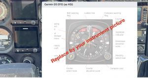
    Garmin G5 Eletronic Flight Instrument System (EFIS), used as a Horizontal Situation Indicator
    (HSI). In this mode the G5 displays lateral deviation from a track selected by a GPS source or a
    VOR receiver as well as vertical glideslope.
    <hr>
    <p>Click on the instrument to open it's Pilot's Guide.</p>
  </div>
  <div id="avidyne" hidden>
    The Avidyne IFD440 navigator serves multipe functions.
    <ol>
      <li>a navigation receiver for analog navigation aids like VOR, ILS as well as a GPS receiver</li>
      <li>a VHF-communictation transceiver</li>
      <li>a flight management system, which allows to create and edit flightplans</li>
      <li>a moving map, displaying the current flight plan and the plane's current location</li>
    </ol>
    <hr>
    <p>Click on the instrument to open it's Pilot's Guide.</p>
  </div>
</template>

import  PanelMap from '@staski/panel-map';
import images from './images';
import docs from './docs';

var panelAreas = [
    {
      name: 'g52',
      shape: 'rect',
      coords: [352,194,524,355],
      fillColor: 'rgb(255,100,0,0.0)',
      id: '1',
      img: images.imgDemo,
      title: 'Garmin G5 EFIS (as HSI)',
      href: docs.docDemo,
    },
    {
      name: 'avidyne',
      shape: 'rect',
      coords: [898,66,1194,198],
      fillColor: 'rgb(100,255,0,0.0)',
      id: '2',
      title: 'Avidyne IFD440 navigator',
      img: images.imgDemo,
      href: docs.docDemo,
    }
  ];

export default {
  name: 'App',
  components: {
    PanelMap,
  },
  computed: {
    url() {
      return images.imgCockpitPanel
    },
    pas() {
      return panelAreas
    }
  }
}
The panel-map component has a number of Props:
| Prop | Type | Description | Default |
|---|---|---|---|
| pas | Array | see below | required |
| img-width | Number | width of the cockpit panel image | required |
| width | Number | width of the image on screen | required |
| popImgW | Number | width of the instrument pictures | 500 |
pas is an Array of objects, one per instrument (area in the picture):
{
  name: String // describing the instrument. Also used as id of the popup's text element
  shape: String // either 'rect' or 'circle'
  coords: [Number] // the coordinates of the shape as in area map
  fillColor: Color // the color of the shape when highlighted
  id: Number // a unique ID
  title: String // displayed as title of the popup
  img: Image // displayed in the popup
  doc: Document // opened in a new browser tab when clicking the instrument
}
I use https://www.image-map.net to create the image map. It’s free and it lets you copy and paste the generated coordinates.
It is good practice to store the images, both of the cockpit and of the individual instruments, in a folder named images beneath the src directory. Similar the documents for the instruments manuals may be stored in a separate documents folder. You may then „import“ the images through a javascript:
import imgCockpitPanel from './images/demoPanel.png';
import imgDemo from './images/imgDemo.png';


export default {
    'imgCockpitPanel':imgCockpitPanel,
    'imgDemo':imgDemo,
};
same for documents. See the source code for more details.
Remains to say that the component is far away from being a professional piece of software. Popups are fixed in size (more or less) so placement is a nightmare and you may have to try and error to find a suitable image width. Also all of this only works on pointer devices, i.e mobile phones or tablets won’t work. As the areas in image maps are no really rendered in a grid, placement of popups is browser dependent. It works on Safari and Chrome but the placement doesn’t work on Firefox. Finally, overriding the hover or click events will break the functionality.
If you have any questions, just drop me a mail!
