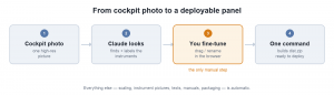
A follow-up to Virtual Cockpit Panel and Creating your own virtual cockpit panel – a step-by-step guide.
When I wrote the step-by-step guide, the honest summary was: the software is simple, but you do the boring part. You opened an image map editor, clicked your way around every single instrument, wrote down pixel coordinates, invented a naming scheme, collected pictures and manuals, and edited a couple of JavaScript files by hand. For a six-pack that is annoying. For a full IFR panel with two navigators, a transponder and a DME, it is an evening.
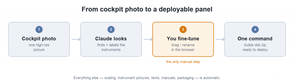
Over the last few weeks that part has essentially disappeared. I can now take one photograph of a cockpit and get a deployable web app out of the other end, with exactly one manual step in between. Here is what changed.
Nobody measures coordinates any more
The core idea: instead of me clicking out rectangles, I hand the cockpit photo to Claude (I use Claude Code, but the desktop app works too) together with a description of what aviation instruments look like, and it writes the panel definition file for me.
That definition is a single file, areas.json, which is now the one source of truth for a panel — geometry, names, descriptions and the links to pictures and manuals all live in it:
{
  "aircraft": "D-ETES",
  "image": "images/cockpitpanel.jpg",
  "areas": [
    { "title": "Airspeed Indicator", "shape": "circle", "coords": [540, 975, 95] },
    { "title": "Garmin GNS430",      "shape": "rect",   "coords": [1636, 1090, 2108, 1284] }
  ]
}
The interesting part is not that a model can see a round thing in a picture. It is that it needs to know what it is looking at. So the repository now carries a document describing how to tell the instruments apart — and that document grew every time the recognition got something wrong on one of my panels:
- a Garmin GI-275 is round and a G5 is square — but the four mounting screws of a GI-275 sit in a square pattern, which is exactly what fooled it the first time;
- a CDI has a needle that is always vertical and usually white, while the course arrow of an HSI can point anywhere and is usually yellow or orange (this one had to be learned twice);
- a transponder is recognisable by its squawk display and IDENT key — the numeric keypad only exists on some models, so its absence proves nothing;
- a stacked avionics column must be split at the bezel seams, one box per unit, and a touchscreen navigator like an IFD540 never has a separate keypad below it — anything under it is a different radio.
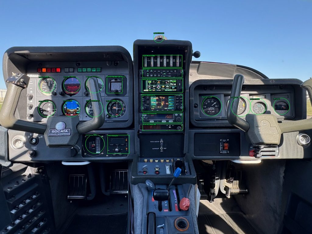
The result on my own aircraft is a complete map on the first attempt: 21 instruments, including the ones half hidden behind the yokes. The registration it now reads off the placard by itself and turns into the browser page title.
The test I actually cared about, though, was a cockpit it had never seen before, in a fresh session with none of my earlier work to lean on. The boxes came back positioned and sized so well that I would not have bothered correcting them — and it named several instruments that appear nowhere in my reference document, some of them fairly unusual.
That last part changed how I think about the document. It is not there to teach the machine what an altimeter looks like; it already knows. It is there to fix the handful of mistakes it makes systematically — and those are few enough to write down.
The whole prompt is three lines
Because all of the knowledge lives in the repository, the instruction I paste into a fresh session is now short:
Create a panel map from the attached cockpit photo.

Fetch https://raw.githubusercontent.com/staski/panel-map/main/scripts/VISION_PROMPT.md
and follow the instruction block in it exactly — including reading both linked
reference documents in full before you start detecting.

When you are done, tell me what you were unsure about.
Everything else — zoom into each cluster before deciding, account for every position in the grid, do not map placards or empty holes, validate the result and then actually look at the overlay you produced — lives in VISION_PROMPT.md and improves without me having to remember to update a prompt in a text file somewhere.
Fine-tuning happens in the browser
The one thing a machine cannot do for me is decide that a circle sits two pixels too far left. So there is now a small editor that runs in the browser, with no installation and no server: load the photo and the panel file, drag the shapes around, resize them, rename an instrument, delete what you do not want, undo whatever you regret, and save.
That is the only manual step left in the whole process.
One command
Everything around that step is now a single script:
scripts/build_panel.sh --image cockpit.jpg --areas areas.jsonIt checks the panel file, opens the editor in the browser and waits for you to press Save, scales the photo down to a sensible size for the web (and scales all coordinates with it), fills in the instrument pictures, descriptions and manuals, and builds a dist.zip you can unpack on any web server. It no longer cares whether that is the root of a domain or some subdirectory.
Going back to a panel later is --update, which picks up exactly where the last build left off.
An instrument library instead of copy-paste
Descriptions and pictures used to be per-panel busywork. They are now looked up from a catalogue: an airspeed indicator, a CDI with glideslope, a GNS430, a KMA24 audio panel — each has a standard picture, a standard explanation and, where I have one, the manufacturer’s manual. The build copies just the ones a given panel actually references out of my instrument directory.
Which means the second panel is dramatically cheaper to build than the first, and correcting a description once fixes it everywhere.
Better still, none of that is baked into the app any more. Pictures, texts and manuals are loaded at runtime, so replacing an instrument photo or a manual after a software update is a file copy on the server — no rebuild, no redeploy.
It works on the iPad now
This one bothered me for a long time: the panel was unusable on a phone or tablet. The whole interaction was built on hovering the mouse, and touch devices do not hover. Tapping an instrument did nothing useful.
The component was rewritten for that. On a computer it behaves exactly as before — you move the mouse over an instrument and its card appears, you click it and the manual opens. On a touch device you tap an instrument to bring up its card, there is a button to open the manual, and a long press opens it directly. The card is placed under the panel instead of beside it, so the picture keeps its size and does not jump around while you tap through the instruments.
It is published as @staski/panel-map version 1.1.0.
What is still rough
I am not going to pretend this is finished:
- The model numbers on avionics remain the thing most likely to need a second look. Geometry is dependable and the instruments themselves come back right far more often than I expected — but whether a radio is a KX155 or a KX165 is something I still check myself, and the session is asked to tell me what it was unsure about for exactly that reason.
- The detection step is hungry. Zooming into every cluster, validating the result and checking the overlay adds up to dozens of steps, and a session can run into its tool limit half way through a panel — you then simply tell it to carry on. It writes the panel file as soon as it has a first complete pass, so an interruption costs you a sentence, not the work.
- A
dist.zipcan get surprisingly large, because real avionics manuals are 20 MB PDFs. Ship only the ones you need. - The whole thing still runs on my Mac. Making it work in a plain server environment is the next thing on the list.
If you want to try it, everything is on GitHub, and the component is on npm. And if you have questions or comments, just drop me a mail!